
Declining Tops Trendline: What It’s Telling You

Ross
Ross is a co-founder of TraderLion and Deepvue. He was mentored by William O’Neil, and co-authored The Model Book of Greatest Stock Market Winners at WON + Co.
Published: September 24, 2026


A declining tops trendline is the simplest line on my charts and the first one I draw. A straight line connecting a series of three lower highs — you can call it a downtrend line if you prefer. It acts as a visual barrier: every time price bounces, it peaks lower than the bounce before, which tells you the stock is still in a downtrend.
I use it for timing. When a stock finally closes through that line, it’s my first sign it may be moving from Stan Weinstein’s Stage 1 into Stage 2. That’s the moment I stop watching and start asking his questions: where is price relative to the moving averages he cares about, and does this pass his test? The line doesn’t give me a buy. It tells me to go look.
Declining tops trendlines also go hand in hand with the other two pieces I’ve written about — launchpad setups and consolidation pivots. The launchpad is what’s underneath, the consolidation pivot is the level, and the declining tops line is the permission slip. This post is how I draw them, what Weinstein’s rules say about acting on them, and four charts where the whole sequence played out.
Table of Contents
Ross Haber
Every new post, straight to your inbox
If this was useful, the next one will land in your inbox the day I write it.
Why the Declining Tops Trendline Matters
Because it’s the earliest honest signal I have. A base can look like it’s bottoming for weeks while the stock keeps making lower highs — and as long as it does, there’s nothing to buy. The declining tops trendline turns that into something visible: the series of lower highs is the downtrend, drawn. When price finally closes above the line, the pattern of lower highs is broken. That’s the first structural change, and it comes before the breakout, before the pivot, before anything the crowd is watching.
It also tells you how a stock is recovering. When a stock sells off steeply, the first declining tops line you can draw is steep. As the stock bottoms and starts working up the right side — move higher, go sideways, move higher again — each new line you draw is less steep than the last. That progression is the whole recovery in one picture: steep, less steep, less steep still, and finally the long-term line breaks and the stock is out. I’m drawing these continually as a base forms, not once.
How I Draw One
Start at a significant swing high and connect the lower highs. The line must touch at least three points to be valid; five or six touches beat three, because more touches point to a more defined trend. For my primary line, I use the longest-term one I can draw — starting at the highest point on the left side of the base or consolidation and connecting every subsequent lower high down and across.
There’s nuance in where you start, and it comes down to time. If only three, four, or five days have passed since the left-side high, there isn’t much of a line to draw yet — maybe one is developing in the very short term. Keep the base’s own clock in mind: a flat base runs a minimum of five weeks, and most other structures want six or seven. You’re looking for the declining tops across that kind of span.
Short-term lines inside the long-term one
For a base building out over weeks or months, you don’t get one line — you get a family of them. New ones keep developing further to the right, starting from highs lower than the all-time high on the left side, and those are your shorter-term lines. Longer-term lines are more significant, but a short one drawn across four or five days is still real information, and it’s usually where the earliest entries live. AMD below has three of them stacked inside one base.
Bill O’Neil used exactly this idea as an early cheat into a cup-with-handle. The official pivot is the high of the handle — but an ideal handle drifts lower on light volume as it forms, so he would draw a declining tops line across the highs of that drift. If the volume was there, he’d start buying as the stock crossed the line, before it ever reached the textbook pivot. Same tool, same logic, decades earlier.
What Weinstein’s Rules Say Before You Buy
This is where a broken trendline gets tested against something stricter. In Weinstein’s framework, the weekly chart and the 30-week moving average carry almost all the weight — Secrets for Profiting in Bull and Bear Markets is where he lays it out. During Stage 1, price chops back and forth across a 30-week moving average that has stopped declining and gone flat: the stock is basing, and the average is losing its downward slope.
The Stage 1 to Stage 2 transition
- Price closes above the 30-week MA and above the top of the base’s resistance. The breakout through resistance is the actual buy signal. Being above the moving average alone isn’t enough, because Stage 1 stocks cross it repeatedly.
- The 30-week MA should be flat or starting to turn up. Weinstein was firm: you don’t buy a breakout while the average is still declining, even if price has popped above it. A rising average confirms Stage 2 is underway.
- Volume expands meaningfully on the breakout week — his guideline was at least roughly twice the average of the prior few weeks, or a strong sustained increase.
- Relative strength should be improving. He used Mansfield RS, and ideally it crosses from negative into positive territory around the breakout. Your charting software may or may not carry Mansfield — the principle survives either way.
- The 10-week MA is his shorter-term reference. In early Stage 2, price should hold above it, and the 10-week should rise and stay above the 30-week. A pullback afterward toward the breakout level or the 30-week is normal and offers a secondary entry, as long as it holds above the average and the prior resistance.
Extrapolating the weeklies to daily moving averages
Weinstein never set separate daily-chart rules, so what follows is a translation of his weekly logic, not something he spelled out. Since 30 weeks is about 150 trading days and 10 weeks is about 50, traders applying his method on dailies typically look for price above both the 150-day (or 200-day) and the 50-day simple moving averages, the 150-day flattening and beginning to turn up rather than still sloping down, and the 50-day crossing above or rising above the 150-day — the daily equivalent of the 10-week over the 30-week.
That daily setup overlaps heavily with Mark Minervini’s Trend Template: price above the 50-, 150-, and 200-day, the 150-day above the 200-day, and the 200-day trending up. Minervini’s rules are stricter and more specific. Weinstein’s test is simpler — a breakout above base resistance and a non-declining, turning-up 30-week average, confirmed by volume and relative strength.
Pro tip: Two clocks run at once. A stock can clear its daily declining tops line and still sit below the weekly averages Weinstein requires — which means you’re early by his book, not confirmed. Know which chart you’re taking the trade on, and size the early one accordingly.
Four Charts: AMD, MRNA, SPCX, SMH
AMD — three lines, each one less steep
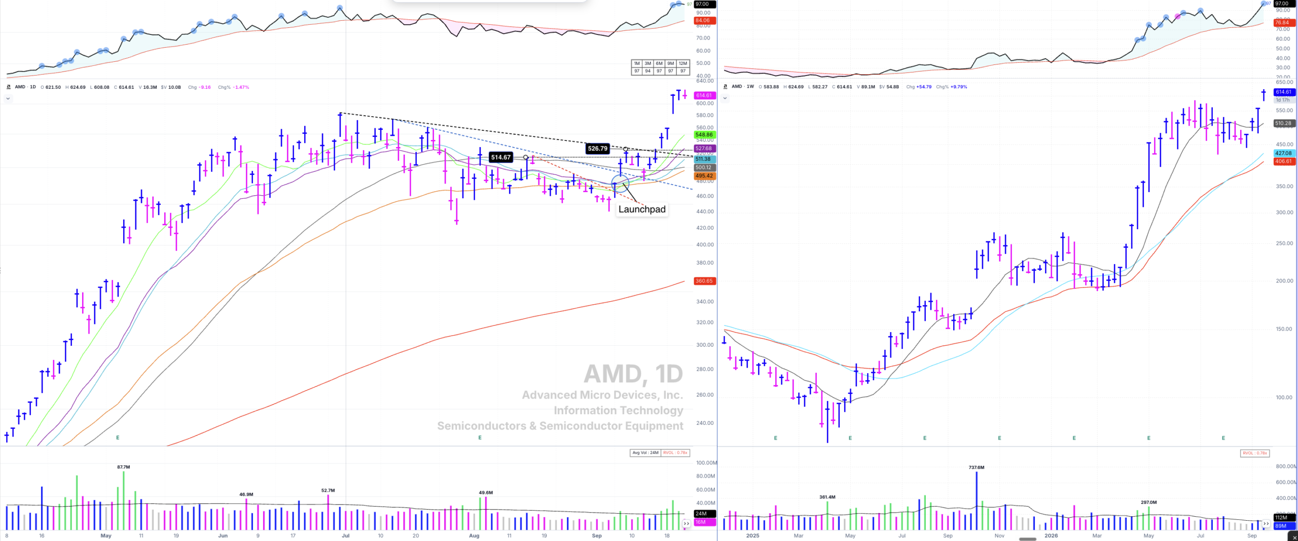
Three lines inside one base. Each break happens a little higher and a little less steep than the last, until the long one goes and the stock is out.
AMD’s current base starts at the high on Tuesday, June 30th, 2026. The final low came Wednesday, July 29th; the stock then shook out but held a higher low on September 3rd, and from there crossed above all its moving averages, which were converged in a tight bunch and beginning to turn higher — the launchpad.
The first line is the short one, beginning Monday, August 17th, connecting the lower highs until price breaks through. That break came with volume picking up, a gap up, a close near the day’s high, and a reclaim of all the converging moving averages. Now the honest caveat: compare it to the weekly, and price was still below the averages Weinstein needs to see. In his book, this is still Stage 1. If you were so inclined to get an early start, this is the absolute earliest you’d want to touch the stock — and the size should say so.
Two sessions later, on Tuesday, September 8th, the stock broke through the next line — the most relevant longer-term one, drawn from the high of Tuesday, July 14th and connecting the highs of July 22nd and 23rd. Up the right side, it formed a short consolidation, almost a handle, worth its own very short-term line. Breaking that one carried it straight through the longest-term line of all, the one starting at the June 30th left-side high. At that point, the Weinstein checklist is satisfied: above the weekly moving averages, which are rising and stacked correctly, and pushing through the base’s resistance area. AMD made a new all-time high of $624.52 on September 22nd, 2026.
MRNA — in before the gap, then again on the flag
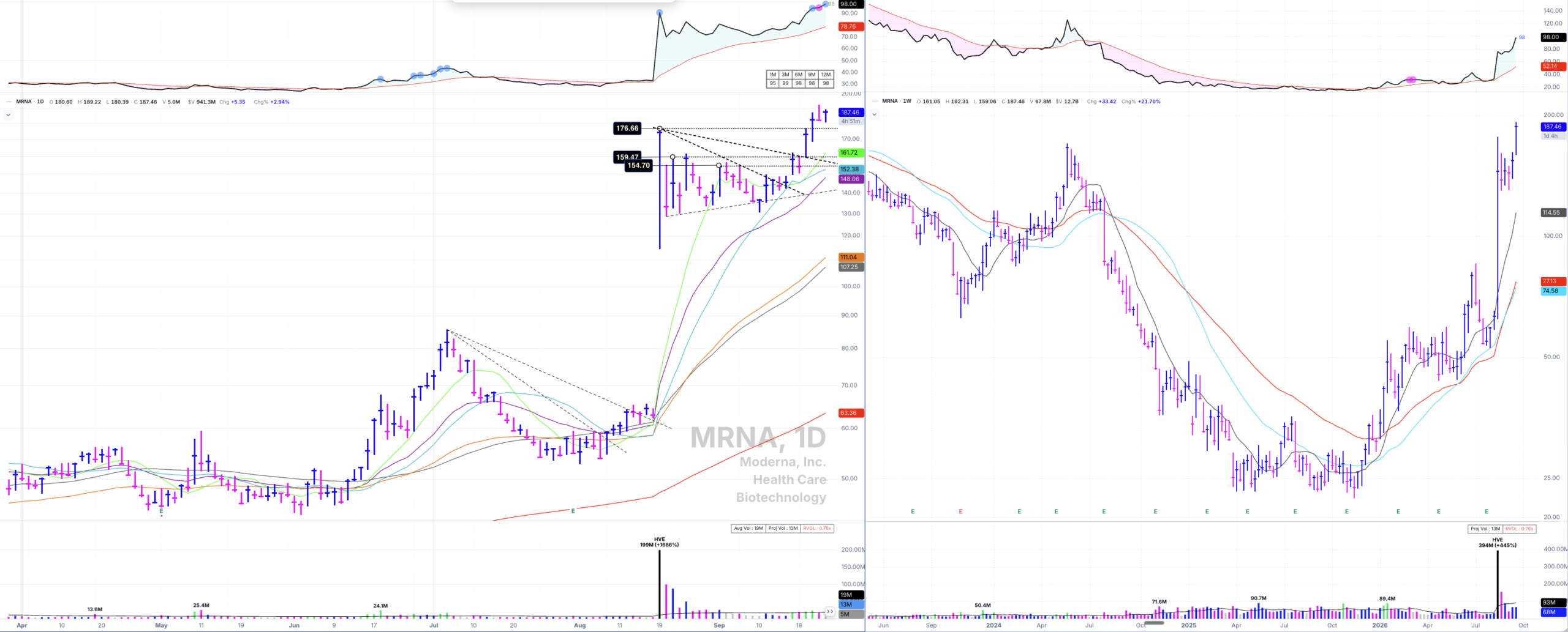
The averages were converging, and the first lines were being broken before the news ever hit.
Before the cancer vaccine news, Moderna quietly built a base that began at the high on July 6th, 2026, and ran through August 18th. The news came out after the close, and on Wednesday, August 19th, the stock gapped up enormously and closed at a high of $176.66.
Here’s the part worth studying. If you’d been watching the space, the moving averages were already converging to the upside beneath price, and the stock was starting to push through its first declining tops trendlines. Around August 11th and 12th, you could have made a case for putting on a few shares—which then held the moving averages, made risk easy to manage, and turned very profitable. I’m sure some folks who buy stocks this way were already holding when the news hit.
That $176.66 high then became the left-side high of a high tight flag — really a pennant — which has just broken out. Inside it, the first line starts at that August 19th high and connects the highs of September 4th, September 11th, and September 14th. Four points, and it starts breaking on the fifth touch: price pushes up and through, finishes below, and doesn’t manage a close above until Wednesday, September 16th. Then it gets super tight, holds the 10-day SMA, and gaps through the first resistance inside the flag. The main resistance in the base above the key moving averages — what Stan would call the buy point — sits at $159.45. You could have started buying on that September 16th push and close, taken the official entry through the second line and the base resistance on massive volume, and added again through the $176.66 high. But ideally, you were in much earlier, closer to the short-term moving averages, while the declining tops lines were still breaking.
SPCX — the first break shakes you out, the second one works
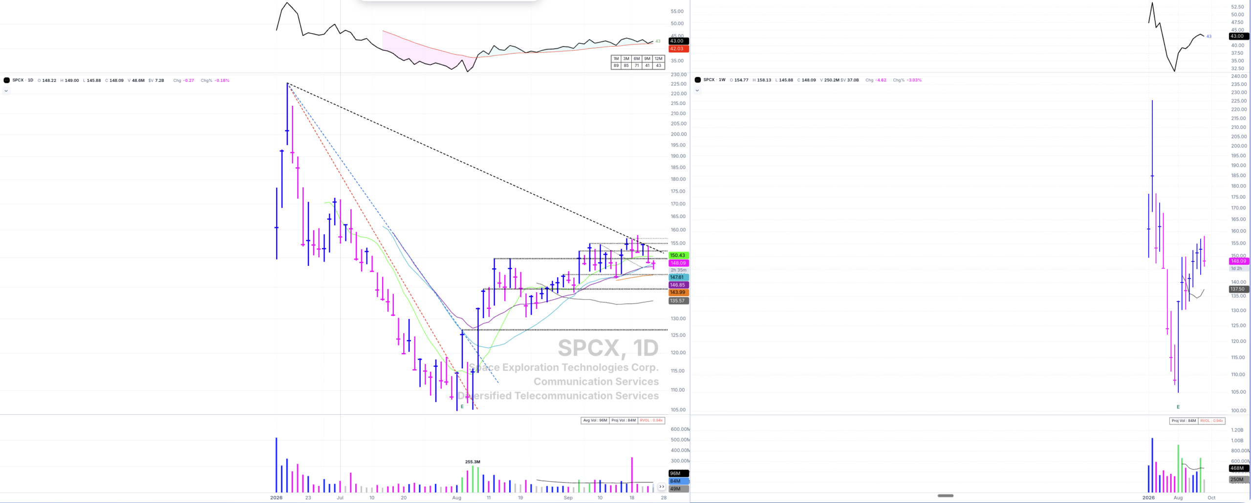
First break: the 10-day reclaimed on big volume, then it bumps its head on the declining 21-day. Second break: the line, the 21-day, and the pivot all at once.
SPCX went public Friday, June 12th, 2026, rose for three days, and hit a high of $225.64 on June 16th. It then rolled over and sold off into an early-August low before trying to bottom. Start the line at that June 16th high and connect down.
The first real break is instructive because it didn’t work. The stock reclaimed its 10-day SMA — which had been resistance the whole way down — at the confluence of that line and the average, on heavy volume, and closed near the highs. Then it found resistance just beneath its still-declining 21-day, bumped its head, and sold off. It came close to the prior low without breaking it, held a higher low, and rose again. If you bought that first pop, you most likely got shaken out. That’s the trade-off of buying early, and it’s why the stop is tight enough to let you buy back.
The second attempt is the one. On a single day, the stock created and broke the next declining tops line, blasted through the 21-day SMA above it, and cleared its first consolidation pivot at $126.71 — the area Stan would call the key resistance in the base. That’s the official entry, and the earliest you could take it with everything aligned. From that blast-off day, apart from a couple of shakes below short-term averages, it has ridden the 23 EMA higher along with the 10- and 21-day. Even on the August 20th shakeout low, it closed a hair above the 23 EMA and hasn’t fallen below. Had you started right at that $126.71 sweet spot, you would never have been underwater.
It’s still developing. A newer line draws from the same $225.64 high, the best fit connecting the September 17th and 18th highs, with another touch on the 22nd and again on the 23rd. On the 24th, it failed there and is retesting the 23 EMA, which has held many times—as volume dried up on the pullback.
SMH — the picture-perfect one
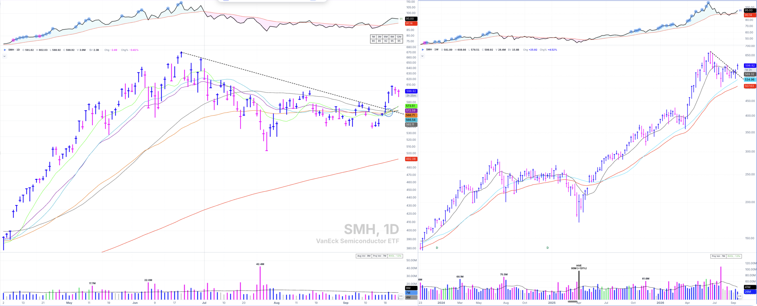
One line, four touches, moving averages crunched up underneath and turning. Then the gap. This is the textbook version.
Forget the short-term lines along the way — SMH is the clean one. The left-side high is June 22nd, 2026 at $671.83. Draw from there, touch the June 30th high, then September 8th, then September 9th. By then, the moving averages are all crunched up and starting to turn higher. Then, on Friday, September 18th, it touched and broke out above the line, and the ETF gapped up and has moved powerfully higher since as semiconductors explode and the averages expand beneath price.
That break was a great spot to buy strength with tight, logical sell stops, because the 50-day SMA is sitting right there in the cluster that’s expanding upward.
What to Do This Week
- Pick five bases forming in leading groups and draw the longest-term declining tops trendline on each — start at the highest point on the left side, connect every lower high, and require three touches before you call it valid.
- Then draw the shorter lines inside each base. Note where each one breaks. You’re looking for the series to get less steep as the stock works up the right side.
- Pull up the weekly chart on every name that has broken a line and run Weinstein’s test: is price above the 30-week, is the 30-week flat or turning up, did volume expand, is relative strength improving? Mark which names pass and which ones are early.
- Check what’s underneath the ones that pass. The Launch Pad convergence plus a broken line plus a pivot overhead is the full sequence — line, launchpad, level.
- Write the stop before the entry. If you’re taking the early break while the weekly still says Stage 1, that’s a smaller position with a tighter stop — tight enough that getting shaken out costs little and you can buy it back on the second attempt, like SPCX.
The Lines I’m Drawing Right Now
Twice a week in The TML Report, I go through the market’s posture and a Focus List of 8–12 True Market Leaders — declining tops lines, launchpads, and consolidation pivots marked on every chart, at the levels I’m managing against.
Read The TML Report