Visual Relative Strength
Master the art of identifying market-beating stocks through visual chart analysis and develop your intuition for spotting institutional buying patterns
While scans and tools are essential, some of the most valuable insights in trading come from visually identifying relative strength patterns on charts. Learning to “see” relative strength without relying solely on indicators allows traders to spot early signs of institutional buying and resilience in stocks during market corrections. This lesson walks you through how to recognize relative strength by visually analyzing stock charts in relation to the overall market, helping you pinpoint strong candidates that may outperform.
Learning Objectives
By the end of this lesson, you will be able to:
- Identify relative strength by comparing stock chart movements against index trends
- Assess support levels with moving averages to recognize stronger stocks during corrections
- Use intraday charting to spot potential entries based on divergence patterns
- Understand how tighter price action and 52-week highs contribute to spotting resilient stocks
Visual Relative Strength: Why It Matters
- Beyond Scans: The Power of Visual Analysis Although scans for relative strength provide valuable initial insights, visual assessment lets you interpret nuances in stock behavior that might not appear in scans alone. By observing higher lows and support around key moving averages, you can better identify stocks that stand strong in a downturn.
- Defining Key Patterns for Relative Strength The key patterns to look for in relative strength are:
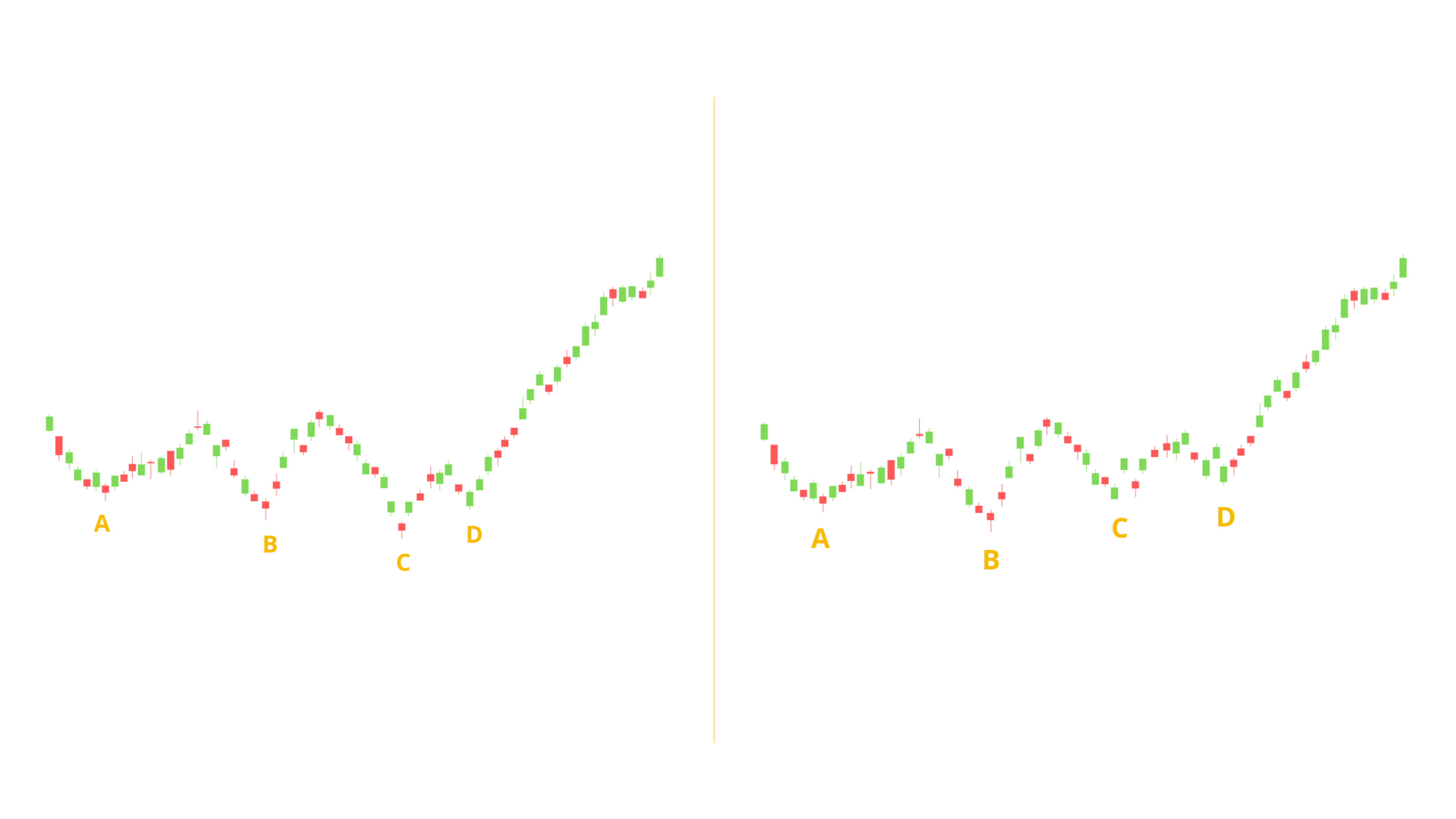
- Higher Lows: When the market hits new lows but a stock hits a higher low, it’s often a sign of buying interest from institutions.
- Moving Average Support Levels: Stocks that stay above the 10-day or 20-day moving averages are typically stronger than those that only hold the 50-day line.

Using Chart Patterns to Identify Relative Strength in Real Time
- Intraday Scanning for Divergence Watch for stocks on your daily or weekly list that diverge from market movement intraday. When an index like the NASDAQ makes a new low but a stock doesn’t follow, it signals support.

- Recognizing Patterns like the “Wedge Pop” During intraday trading, look for patterns where a stock forms a tight wedge or a higher low as the index trends down. When a breakout follows, it’s often a confirmation of strength.

The Role of Moving Averages in Assessing Strength
- Using Moving Averages to Rank Stocks Stocks holding above the 10-day or 20-day moving averages in a correction are generally stronger than those that need the 50-day for support. In deeper corrections (15% or more), even the 10-day average may be lost by most stocks, so watch for those that continue holding up above the 20-day or 50-day.
Building Your Watchlist for Resilient Stocks
- Using Lists Strategically
- Daily List: Track around 30 to 40 stocks each week that look strong.
- IPO List: Add stocks that recently went public and are post-lockup, as these often have room to grow.
- Focus List: Refine your list based on daily performance to find stocks holding up intraday as the market pulls back.
- Routine for Monitoring and Adding Stocks Keep flipping through these lists during the day to find stocks with strength on market down days. It’s essential to look for higher lows and price patterns like bull flags in stocks on your list as the market pulls back.
Case Study: Livongo (LVGO)
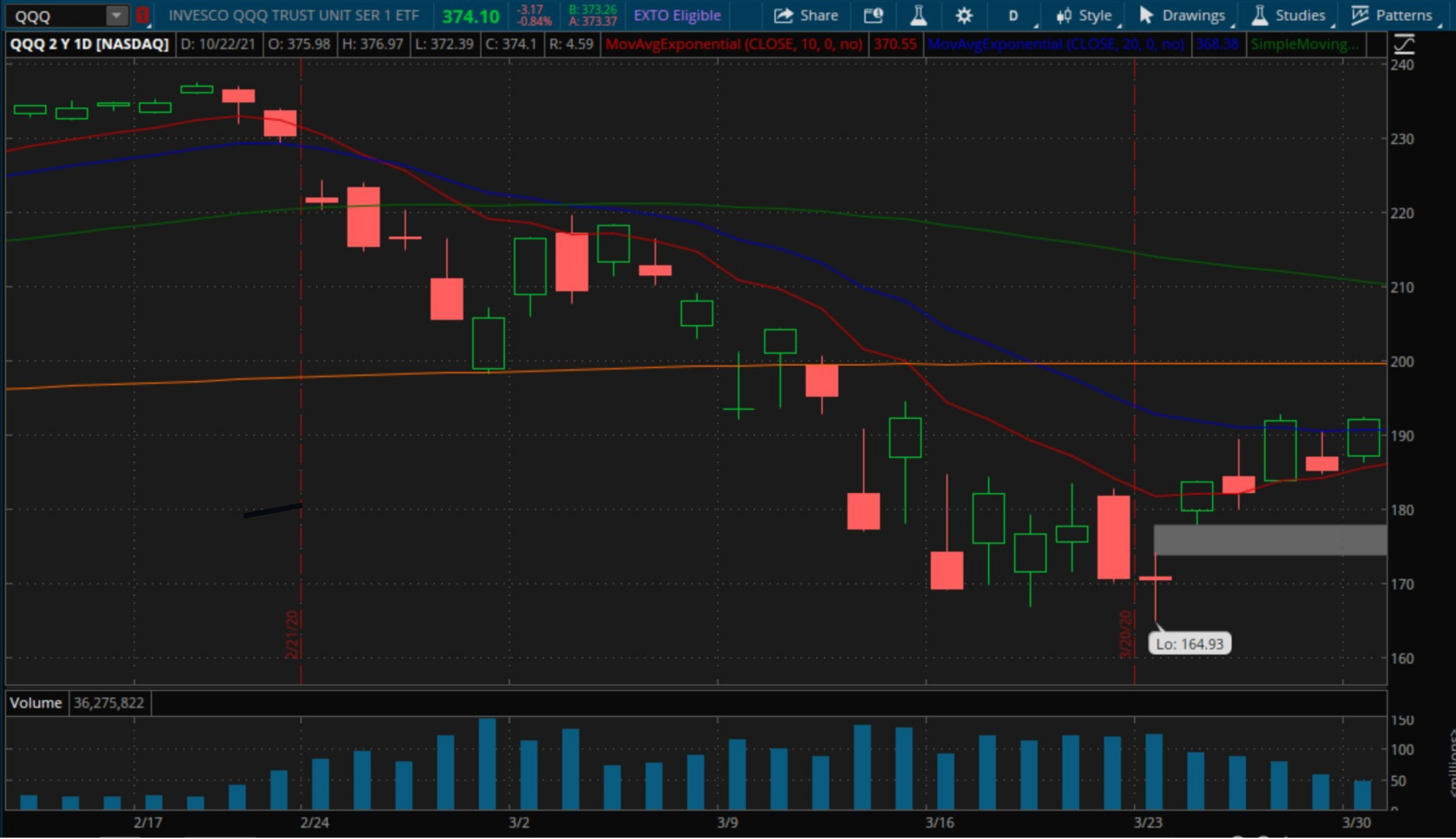
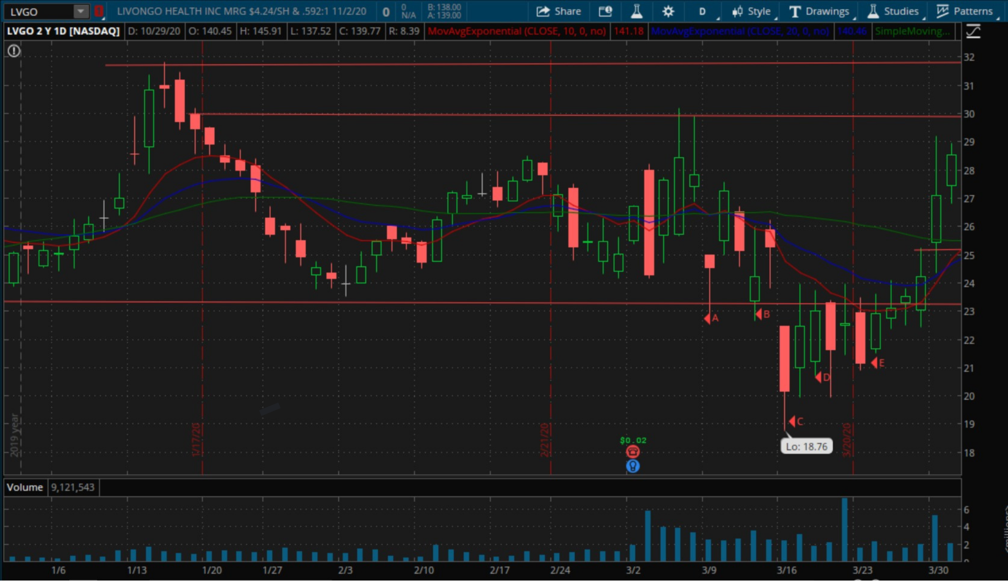
- How Livongo Demonstrated Relative Strength During the COVID selloff, Livongo exhibited a pattern where it made higher lows while the NASDAQ continued to decline. Despite early volatility, this resilience highlighted institutional interest, setting the stage for a substantial rally post-selloff.
- Key Takeaways from Livongo’s Chart Pattern
- On each market drop, Livongo either held steady or made higher lows.
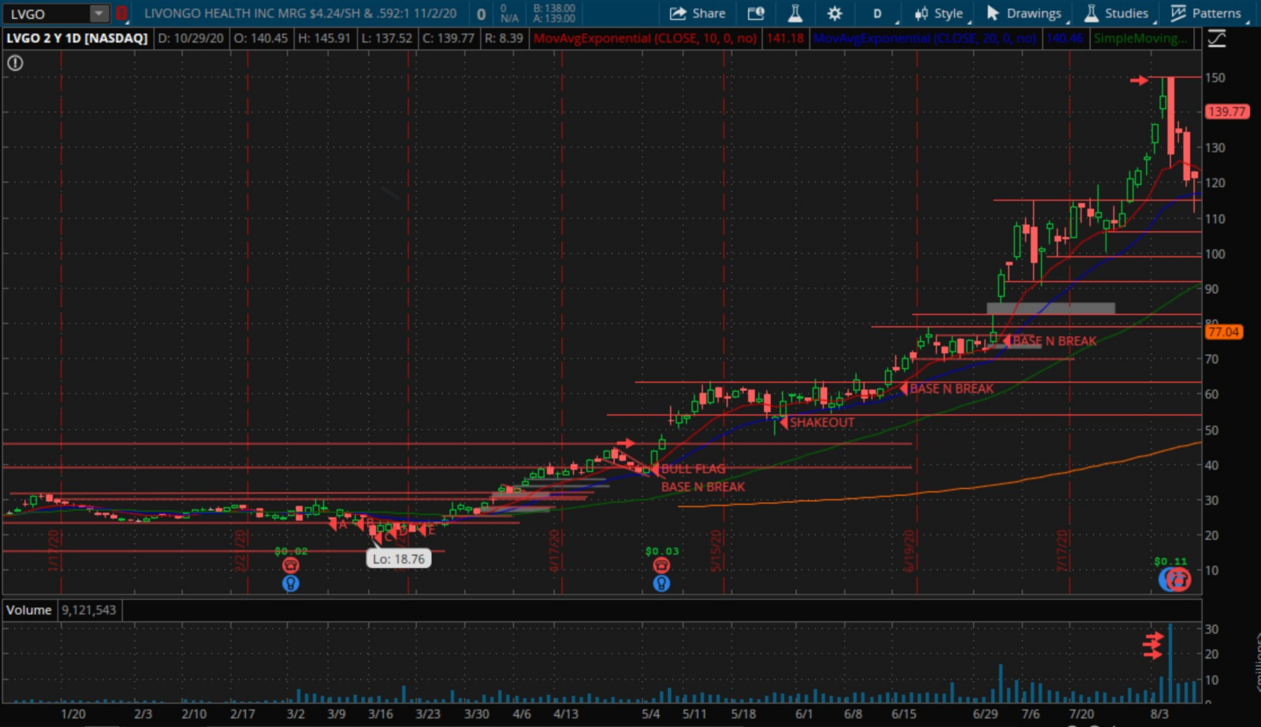
- A wedge pop occurred around $24, signaling a breakout from its base, aligning with the NASDAQ’s recovery.
- Following this confirmation, Livongo went on to rise by over 500%.

Recognizing Tight Price Action and 52-Week Highs
- Why Tight Price Action Matters Tighter price action is a sign of reduced volatility, often preceding upward movement. In corrections, stocks with tight price action and steady support levels are often poised for growth when the market recovers.
- Watching for 52-Week Highs in Corrections A stock making a 52-week high while the index is down is one of the strongest signals of relative strength. These stocks often lead the next uptrend.
Action Items
- Practice Visual Scanning: Spend time each day visually scanning for relative strength patterns by comparing stocks on your watchlist to the overall index.
- Apply Moving Average Levels: Track moving averages on your watchlist stocks. Notice which ones hold the 10-day, 20-day, or 50-day during a correction.
- Identify High-Strength Stocks During the Next Downturn: When the market pulls back, practice finding stocks that either hold steady or make higher lows.
Conclusion
Mastering the ability to spot relative strength visually is a skill that will greatly improve your stock selection and timing. By observing higher lows, key moving average levels, and tight price action, you can identify strong stocks even when the broader market struggles. Building this skill will make you more adaptable and confident, ready to uncover winning stocks in both bullish and bearish environments.
